Color Plus 1 – Polymer Clay Color Mixing Trick
Video #413: Making it quick and easy for you to come up with your own custom color palette blends.
More...

IN THIS POST: — plus 1 — color mixing — (Topics marked with an asterisk* are discussed in the Comments Section below).
Topics Covered In This Video:
- This color mixing trick is something that I call the Color Plus 1 Method. I use it all the time… and you can too.
- Color mixing polymer clay can be intimidating for a lot of people, but this trick will make it a lot easier to come up with your own custom color palette.
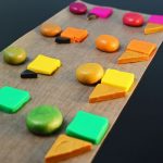
- I show some colors from the Premo color line, that don’t go together very nicely straight from the pack… Fuchsia, Orange, Cadmium Yellow, Green and Raw Sienna.
- If I take those same colors and Plus 1 them with some Gold or Black or any other color, I can make a really neat color palette that pulls everything to together in an aesthetically pleasing way.
- I demonstrate mixing 1 part of the base color Fuchsia and 1/2 part Gold clay to make a beautiful iridescent Raspberry color. I then continue down the line, mixing 1 part color and 1/2 part Gold to each of the colors. Watch the video to see how simple this technique is to do.
- Mixing my plus one color (in this case it was a 1/2 part Gold), to each of the base colors I want to use, creates a new color palette that flows together, because each of them have the underlying Gold color in common.
- I show the same formula being done with the same base colors (Fuchsia, Orange, Cad. Yellow, Green, Raw Sienna) mixed with a Plus 1 color of 1/8 part Black. Because Black is such a strong color, I chose to much less in the mix, than I did the Gold.
- You can use this Plus 1 color mixing trick for making palettes with any colors that you choose. You will have to experiment with amounts of the Plus 1 color you would like to add, because each color has a different strength.
00:00:04 –> 00:00:09 Hi Guys, its Cindy Lietz, your Polymer Clay Tutor, and in today’s PCT Mini Tute, I’m going
00:00:09 –> 00:00:17 to show you a really neat color mixing trick that I like to call, Color Plus 1.
00:00:17 –> 00:00:22 Now I know that color mixing can be pretty intimidating for a lot of people, but this
00:00:22 –> 00:00:28 neat little trick will make it a lot easier to come up with your own custom color palettes.
00:00:28 –> 00:00:35 Now I’ve got some colors here of Premo! clay that don’t go together very nicely, they’re
00:00:35 –> 00:00:43 straight from the pack, and I’ve got some Fuchsia, Orange, Cad Yellow, Green and Raw
00:00:43 –> 00:00:44 Sienna.
00:00:44 –> 00:00:48 Now these colors, if I was to just use them straight from the pack, they wouldn’t look
00:00:48 –> 00:00:57 that great together, but if I Plus 1 a new color, such as Gold or Black, I can make a
00:00:57 –> 00:01:01 really neat color palette where all the colors go beautifully together.
00:01:01 –> 00:01:08 So here I’ve got some new colors here where I’ve added a little bit of Gold to them, and
00:01:08 –> 00:01:14 they all look lovely together, now let me explain this technique a little bit more to
00:01:14 –> 00:01:15 you.
00:01:15 –> 00:01:24 Now, if I take…if I take a little cutter and I take 1 part of each of the colors…and
00:01:24 –> 00:01:30 let’s get this out of the way, and I add a new color to them…so I’ve got here…
00:01:30 –> 00:01:37 I’ve got Fuchsia, and then…I’ve got 1 part Fuchsia and I add a half of a part of
00:01:37 –> 00:01:39 Gold… this is just Premo!
00:01:39 –> 00:01:45 Regular Gold, and mix them together I’ll get this color here, and it’s kind of an iridescent
00:01:45 –> 00:01:49 Raspberry type color that’s really beautiful.
00:01:49 –> 00:01:54 If I do the same thing to the Orange, I add 1 part Orange and a half a part Gold, I get
00:01:54 –> 00:02:02 this color here which is a real pretty color, same with the Yellow, the Green and the Raw
00:02:02 –> 00:02:08 Sienna, now you can see all these colors look pretty together now, because their underlying…there’s
00:02:08 –> 00:02:15 an underlying commonality to all these colors which is the Gold, right?
00:02:15 –> 00:02:20 So they automatically go together because the Gold’s in all of them, now you can do
00:02:20 –> 00:02:24 this with any colors that you want, you could use any of your base colors that you want,
00:02:24 –> 00:02:28 and then your additional color can be any color that you want.
00:02:28 –> 00:02:35 I’ve done the same experiment here, only this time I added some Black clay to it, so…but
00:02:35 –> 00:02:42 because Black is such a strong color…I’ll move this here a little bit, because Black
00:02:42 –> 00:02:49 is such a strong color I used a lot less of it this time.So I used 1 part Fuchsia and
00:02:49 –> 00:02:57 an eighth of a part of Black, and I got this Burgundy…or this Purple-y kind of color
00:02:57 –> 00:03:04 here, for the Orange, I mixed the same thing, 1 part Orange and an eighth of a part Black,
00:03:04 –> 00:03:10 and I got this sort of Brown color, which is actually pretty similar to a Raw Sienna,
00:03:10 –> 00:03:13 only a little lighter.
00:03:13 –> 00:03:21 Then for the Yellow, when I mixed the Black in, I got this Green color, and for the Green,
00:03:21 –> 00:03:27 when I mixed the Black in, I got this rich kind of Tropical Type Green, and then the
00:03:27 –> 00:03:33 Brown, when I mixed the Raw Sienna and the Black I got a little bit of a Darker Brown.
00:03:33 –> 00:03:34 But as you can see…
00:03:34 –> 00:03:39 I’ll get these outta here for distraction purposes, you can see that these colors now
00:03:39 –> 00:03:43 go together beautifully too.
00:03:43 –> 00:03:51 So this would work for adding White as your extra color, your plus 1 color or Ecru or
00:03:51 –> 00:03:57 Copper or any of them, you may just have to experiment a little bit with the amounts that
00:03:57 –> 00:04:03 you add, because of the strengths of the different colors that they are, but this way, you can
00:04:03 –> 00:04:09 pull any kinda weird colors that you have in your collection, and make a palette with
00:04:09 –> 00:04:10 it.
00:04:10 –> 00:04:16 So I hope that was helpful for you, if it was make sure to press that like button that
00:04:16 –> 00:04:17 would be great.
00:04:17 –> 00:04:24 And my question for you today is, are you a little bit intimidated by color mixing?
00:04:24 –> 00:04:31 And would you like to see me do more of these types of color mixing tips and tricks?
00:04:31 –> 00:04:36 Put your answers in the comment section below, that would really wonderful.
00:04:36 –> 00:04:41 And don’t forget to subscribe to our channel, we have new videos that come out every week
00:04:41 –> 00:04:43 and you’re not gonna wanna miss them.
00:04:43 –> 00:04:46 So we’ll see you next time and bye for now.
Our goal is to translate these videos into as many languages as possible. If you are interested in helping with this initiative, then please do contact us and we will figure out a way to make it worth your while :)
Resource Links:
- Related Video: Polymer Clay Color Mixing Color Saturation
- Related Video: Understanding Polymer Clay Color By Making Mud
- Related Video: Making Small Test Blends With Your Polymer Clay Colors
- Related Video: Mixing Custom Color Recipes Tutorial Intro
- Related Video: How To Mix Polymer Clay Tutor Color Recipes
- Amazon: Premo Clay Sampler Pack, Assorted Colors (24-Pack) **
Resources marked with a double ** asterisk are affiliate links. If you click on them and decide to buy something, we may receive some compensation. This does not affect the price you pay in any way. What it does do, however, is helps us to continue providing free videos for you, here at the PcT website. Using our links to purchase your tools and supplies, is always greatly appreciated.
Sponsored Ads & Special Promotions
Shareable Images


To share this full blog post anywhere on the web that allows links in comments, here's a shortened url to copy and paste...
>> https://mypct.ca/v413 <<
Want to chat about today’s post? That’s what the comment section below is for. Scroll Down… We’d love to hear from you!
Or... if you would like to request a topic for a future post, here is the link to do that… PcT Suggestion Box
I loved ur video on color plus one. Would like any more like that u can do.
Also I enjoy ur little videos more than anyone else on utube!!!!!
Hi Cindy,
I just watched your demonstration on color mixing. I like it and wanted to comment… love your blog site!!! Will explore every inch later tonight. But the reason I write is to answer your question and yes! I would very much like to see more on color mixing.
Have a wonderful evening!
I am from Sacramento California.
Judy Rasmussen
Wow Cindy, what a great video, I for one would love to see more videos on color mixing, It’s one of the best way of making one’s work really unique!
Thanks again for another winner!
Joy:)
re: Color Matching,
Hi Cindy,
I just watched your mini +1 tut & YES!!! I am intimidated by CMing…LOL
Thanks,
Brenda
PS- YOU ARE THE BEST!!!!!
Great video on color mixing! Please make more! I’m new at polymer clay and I’ve learned so much from you. You’ve answered many of my questions I had. TFS
knit crochet bead sew cross-stitch polymer-clay tie-dye;
all use colour, always been mystifed about it;
NOT anymore;
your explaination technique is TERRIFIC
THANKYOU! from the youtube newby
Wow! That was very helpful! Thanks for sharing!
I just love this video – my favorite so far because having the right color is the most important and fun element to work with clay. It will save so much time and clay for me. I usually bring the blouse that I want to make a necklace for and try to mix the colors by guess. Never thought that adding the same common color would do the trick. So fabulous! Thank you so much!
Loved it!
Such an easy way to to do this too thanks for sharing your tips
:)
Eunice
Wow! Great tip. Thank you!!! I do find coming up with a color palette from scratch to be very intimidating. Would love to see more tutes on the subject.
Just got back from Geneva to find this fascinating video waiting! What a clever idea to mix a little of one colour to several others so that they all have something in common! Thanks Cindy. Yes please, more videos on colour mixing, this is something I can never get right. I made a necklace of polymer beads with a palette of colours and as I walked to the front door my daughter said, “Mum, you’re not going out wearing that necklace, are you?!” ‘Nuff said.
I am very intimidated by blending color so I don’t blend them. I might be color blind, LOL. I basically buy the colors that I want from what is available. Cindy thank you so much for this tip. I will definitely use it to experiment with colors more.
Yes, Cindy, this kind of tip helps keep the palette we have on hand workable without running out and shopping for the ‘right’ color.
anna
Great tip. Have heard of this, but illustration now makes sense. There are other tricks artists use to “help” colors be more companionable. Would like to know more about this. I usually tone gold with a bit of black, and add a bit of blue to straight black. Guess that’s why skinner blends look so much better than PC straight out of the wrapper! Yes, more on this would be fab.
Thanks,
This is a great idea! I’ve always been intimidated with mixing colors. I can’t wait to try this. Would it be okay if I demo’d it for my Polymer Clay Guild?
Thanks again!
This was wonderful! I can’t believe you put this info out for free! I would love to see more tutes on color mixing, color theory, selection, etc. I understand a lot, but have soooo much more to learn! Thanks for all you do for us, Cindy!
Question- I was wondering if this +1 technique would work on adding translucent to all your selected colors. Would that make them go together or would it not work because it’s not really a color? Also does this technique work with every color or is there some colors that it just does not work with?
Thanks.
Not sure if only transparent would switch it up as a plus, but think a percentage of transparent and a percentage of your plus up color would surely be cool.
Cynthia, I mix some translucent into ALL my clay as it makes it shinier. (Translucent is a really shiny clay.) (Lemme qualify: Premo translucent is really shiny. I can’t confirm about translucents from other companies.) It doesn’t affect the color, though.
I agree with Jocelyn and Binky, Cynthia… Because translucent is not a ‘color’ it won’t really work as a +1 color that will tie together a color palette. But adding Trans to all your colors in your palette will bring a common translucency to the palette colors and give them a common appearance in the way the light bounces off of them. Plus, like Binky suggested it will bring an added shine to the clay. If you wanted to add a different +1 color, as well as the translucent, to all your colors, that would work very well!
Loved it, and, yes, I would love to see more videos on color … Thank you,
I would love to see more color mixing tips–it’s the main reason I signed up for your site, I’m hopeless when it comes to color. This is such an awesome idea, I’m going to go try it out.
I would love to see more color mixing tips–it’s the main reason I signed up for your site, I’m hopeless when it comes to color. This is such an awesome idea, I’m going to go try it out.
yes it is very interesting to see how you do it
That was really interesting. Being able to pull together colours that don;t “usually” go together using this trick is going to be very useful. Thanks Cindy.
Color mixing is very exciting for me, Cindy, and so I am a hoarder of palettes and recipes…including YOURS, of course! Like this tutorial very much and would love more.
Thanks again Cindy! Great information. More color theory/mixing tips would be wonderful.
Yes! Yes! More color mixing. I seem to stumble on some very nice color combinations, but I have plenty that miss the mark. And I’m completely intimidated by the idea of mixing colors to get what you want. I’m going to try this +1 technique today. It is very intriguing.
That was a very helpful video, Cindy. I sometimes have the opportunity to teach people who know nothing of PC, and they get a little carried away with their “extra” colors — black, especially. Thank you for your instructions.
I have always loved color. I understand it intuitively but have gone around in too many circles in trying to reach the perfect palette. Loved, loved this video. Thanks for your straightforward approach to beautiful color combinations. Please do more!
very excellent tip! I have always used the undertone rule to mix colors in doing interior design and when I used to design clothing, so many patterns and textures can be used if the undertone of the colors are the same, I especially like the warm colors.If you can put an outfit together or decorate a room you can mix colors because you are already doing it, just choose the undertone you want pinks,oranges.yellows or metalics for warm or blue or black for cool are some of the examples.When choosing fabrics if 2 pieces just don’t look right together it is most likely that one is warm while the other is cool. Glad to see the new colors and the old colors back.
.
Another great tute! I’ve been working with polymer clay for almost 14 years and my main problem is color. I tend to find a pallet that I like and stick to it. Now I have been motivated to experiment more. Thanks again!
Very helpful Cindy as always, silver is also great ,yes would love more color mixing ideas.
I would love to see more color mixing techniques. You are a great teacher!
Ellen
Downers Grove, IL
Cindy,
I’ve tried color mixing and sometimes it works and sometimes not. I loved your video and would love to see more. I enjoy all your videos, even the goofy ones.
Susan
I love color, it’s one of polymer clay’s main attractions for me! I was watching another video just today by a knowledgeable designer and was so impressed with her correct color theory terms, that I felt like I need to further my color theory education. This just confirms my goal. So YES….please do more free videos on color theory and mixing, we love them!!
I do find color mixing intimidating, so I usually use it from the Premo packet. I love this color mixing tip & would love to see more.
you can never have too much colour theory
A big yes for more on mixing colours. That was very interesting.
I am particularly fascinated by the yellow+black turning green.
Yes Cindy – I would love more tutorials of this kind -thank you!
Black is a misnomer in alot of created colors. There is a misunderstanding that you can create a real black for most any process. My experience is with fabric dyes and paint. It is generally accepted that most any color except white and black are mixes of other colors to get the desired shade. It is also well known that white is the absence of any color tint. But most do not know that black is a color mix also. When using polymer clay, we all understand how to get that grey mud, right? Just gather up all those scraps and mix them together. Do you know you could make it a shade of black by adding indigo or alot of dark blue and a bit of other dark colors? This is what the manufacturers are doing, using color formulas to get black. A true black is expensive to produce, so what we get is a dark, dark blue mix that really, really looks like black but when mixed with other colors, the perception changes… because you have just upset the formula. That is why the yellow and black made a green.
You did a great job explaining the color Black, Stella.
Just so everyone understands, when it comes to paints, polymer clays or anything that gets it’s color from pigments from the Earth, the colors are not actually ‘pure’ but are actually a combination of colors. This is especially true for the color black.
What I love about the main colors in the Premo line, is that they are based on the same pigments that are used in the art paint world. So, once you get used to mixing artist colors together, and how the pigments behave, you can predict what they are going to do even before you mix them, whether you’re working with oil paints, acrylic paints or Premo polymer clay.
The problem with some of the brands of polymer clay that aren’t based on the artist color palette, is that their ‘designer’ colors can be quite complex. Meaning the color that looks ‘blue’ to an untrained eye, may contain all kinds of unexpected colors like yellow, red, black, white, etc… so when you go to mix it with what looks to be a ‘red’ (which may also contain a whole bunch of different colors), you can end up with a muddy grey or brown, instead of the purple you were expecting.
It is because of these complexities, that people have so much trouble mixing colors. I hope that I can help people by simplifying the concepts and make it easier to understand.
Oh-oh Cindy- you’re giving away too many secrets – now we won’t need you for the color palettes – we’ll be experts ourselves : )
Cindy this is an excellent tute. Loved the way you presented the concepts. I knew to do it with black, but am so absorbed in making “stuff,” that structured color mixing always went to the side. One of the reasons I was thrilled to find this blog, because you shared wonderful color palettes with us.
If you use the search facility and link to all of Cindy’s “color” blogs and comments, especially the Teardrop Blend Shift Tute, it’s a great overall hands on guide to color and I have learned so much by doing so. Thanks!
Also am going to try gold plus ups, with layers of gold metal sheets and some mokume gane soon. Bet using this approach will give some lovely fresh colorways with technique.
Cindy I Loved your latest video posted on You Tube
Your doing a Real service for all of us who are still baffled by what colors go with this or that color, shade, value — this mini tute solved that problem
Got to agree with Sue F.
In fact she took most of the words out of my mouth! Color can make (or break) a design if you are a little bit “off” color it can ruin hours of careful work.
So big thanks to Cindy, I now know I can take her tips and tricks and run with them. well only as far as the oven hee hee………cheers xx……………………
That is a neat trick for creating palettes, Cindy!
It’d also be an easy way to add a new twist to an existing palette, or just to dress up the standard package colours so you’re not using the same old same old.
I’ve sometimes added one or two colours in varying amounts across a palette to help tie it together, but I’ve never used it as the primary technique for deriving the palette in the first place: I’ve always had an almost-there-but-not-quite-right set of colours to start with.
I do think quite a few people find colour mixing a bit intimidating (that’s presumably one of the reasons behind the realignment of the Premo colour range over the past few years), and I’m sure your tips and tricks in this area would be most welcome.
Colour selection and palette selection tips and tricks would also be interesting, even to people who are completely comfortable with colour mixing. General approaches, sources of inspiration, handy references… there’s always something new to discover, and playing with colour is fun! :)