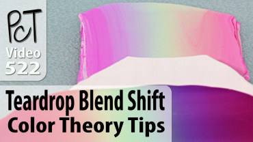
Teardrop Blend Shift – Colorway Gradient Variations
Video #522: A simple trick for changing the look of your Teardrop or Skinner Blends without having to start all over again from scratch.
More...

IN THIS POST: — skinner blends — teardrop blend — color blends — color gradients — colorways — color shifts — blending — ombre — lietz blend — (Topics marked with an asterisk* are discussed in the Comments Section below).
Topics Covered In This Video:
- The concept of this color blend shift is based on the same principles that I also showed in my Color Plus 1 Method.
- This color shift technique adds another color across your entire Teardrop Blend, which creates a whole different blend with a different tint.
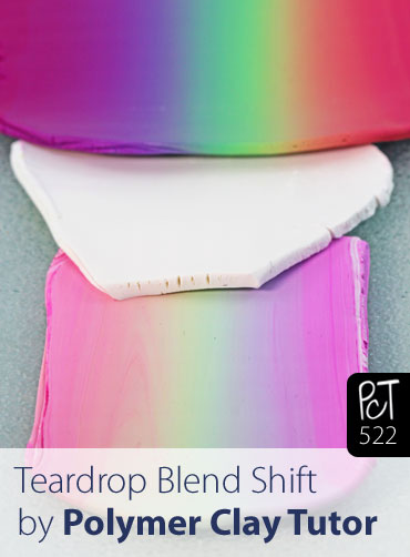
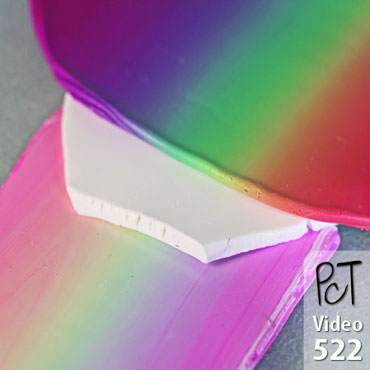
- In a previous video, I showed how to do a Rainbow Teardrop Blend, which is a multicolored Skinner Blend technique.
- Take a sheet of any color of clay (I used white), and add a strip of the Rainbow Teardrop Blend (or any other Skinner Blend) on top.
- Then, by passing the clay through the pasta machine like you would a regular teardrop blend, the added clay (white in this case) gets evenly distributed throughout the blend.
- I show examples of what shifted rainbow blends look like when white, 18K gold, black, ecru, cadmium yellow, raw sienna, and translucent clay have been added as the shift color.
- Come up with your own blends by adding any color you wish, in any amounts.
00:00:03 –> 00:00:08 Hi guys, it’s Cindy Lietz, your Polymer Clay Tutor and today’s Studio Tip, I’m going to show
00:00:08 –> 00:00:13 you how you can get more contrast in your polymer clay Skinner Blends.
00:00:13 –> 00:00:19 Now, if you’re not familiar with what a Skinner Blend is, that is a color blend where you
00:00:19 –> 00:00:27 can take more than one color of polymer clay and then you blend it into a gradient sheet
00:00:27 –> 00:00:33 or an ombre kind of technique like this where you have one color shift to another color.
00:00:33 –> 00:00:40 Now, you can do this with more than one color, I mean more than two colors too, if you want
00:00:40 –> 00:00:44 but there’s a lot of cool things that can be done with a Skinner Blend.
00:00:44 –> 00:00:50 In fact, I was going to this week teach you how to make one of these Zipper Canes that
00:00:50 –> 00:00:58 uses Skinner Blends but during the process of making the samples, I realized that a lot
00:00:58 –> 00:01:05 of you may not understand how to get enough contrast in your Color Blends so that you
00:01:05 –> 00:01:07 can get the proper effect.
00:01:07 –> 00:01:15 Now, I’m –now I’m just going to show you the samples that I have here, I have these
00:01:15 –> 00:01:21 Zipper Canes that are done in several different colorways but if you carefully look at the
00:01:21 –> 00:01:28 different patterns here that we’ve got, you’ll be able to see that the– the canes that have
00:01:28 –> 00:01:30 the most contrast in color.
00:01:30 –> 00:01:39 So they go from the darkest to the lightest will have the the best effect in showing this
00:01:39 –> 00:01:44 Zipper Cane effect so the way the Zipper Cane is made is you make a blend then you chop
00:01:44 –> 00:01:47 it up and you flip it back and forth and do these different things with it which I’ll
00:01:47 –> 00:01:53 show you next week but if you have a blend that has a lot of contrast.
00:01:53 –> 00:02:00 So, from from the dark to the white here, you will get a cool effect but if you have
00:02:00 –> 00:02:05 the colors are too similar to each other, like in this case we’ve gotta blend from a
00:02:05 –> 00:02:09 Cadmium Red to kind of a Pearly Pink color.
00:02:09 –> 00:02:14 Here, the colors are too close and value so they’re both medium colors there neither or
00:02:14 –> 00:02:23 light and so beside each other even though the effect is kind of cool, it loses the drama
00:02:23 –> 00:02:28 to it because it’s– the colors are too similar and especially from far away, or if you do
00:02:28 –> 00:02:32 reduce this cane you would start losing the pattern visually.
00:02:32 –> 00:02:36 I mean the pattern’s there but you just can’t see it as well because the colors are blending
00:02:36 –> 00:02:38 with your eyes.
00:02:38 –> 00:02:49 So, the easiest way to get a really obvious contrast between two colors is to use a dark
00:02:49 –> 00:02:57 color like I’ve got here this is a Ultramarine Blue and then White, so White is White and
00:02:57 –> 00:03:02 these are both Premo colors but you know, there’s a lot more blends than just from color
00:03:02 –> 00:03:06 to white and I mean this is what most people will show you when they’re talking about a
00:03:06 –> 00:03:13 Skinner Blend is they’ll show you, you know, from a color to White and so what will happen
00:03:13 –> 00:03:18 is you’ll go and you think well I don’t want to just do White– White and colored one I
00:03:18 –> 00:03:23 want to do two colors that I really love so you pick something like these two colors here.
00:03:23 –> 00:03:27 Now, these are the two new colors from Premo.
00:03:27 –> 00:03:34 They are what is this one this one is Periwinkle and this is Wisteria and they’re both very
00:03:34 –> 00:03:40 pretty colors but if you blend them together into a Skinner Blend or a Teardrop Blend,
00:03:40 –> 00:03:44 which is my method of doing it which is much easier and I’ll show you that in up I’ll show
00:03:44 –> 00:03:47 you how it goes in a second.
00:03:47 –> 00:03:53 If you blend those two colors together and into a gradient like this, because these are
00:03:53 –> 00:04:02 equal value, they’re both medium colors, the blend is very pretty but it’s not going to
00:04:02 –> 00:04:07 work very well for a zipper cane because the contrast isn’t that high and you can really–
00:04:07 –> 00:04:11 you can test out your blends to see if there’s much contrast if you’re not seeing it here
00:04:11 –> 00:04:17 by just putting the two ends together and then if you kind of squint your eyes if the
00:04:17 –> 00:04:21 color sort of melt together then and there’s no contrast there.
00:04:21 –> 00:04:27 If I put the this blend here, for example, next to each other, and I squint my eyes,
00:04:27 –> 00:04:35 I can still see that there’s a big difference between light and dark but say you’ve done
00:04:35 –> 00:04:39 this blend you think it’s really pretty, you still want to use it you don’t have to throw it away
00:04:39 –> 00:04:43 What you can do is you can amp it up.
00:04:43 –> 00:04:46 Now, it’s very simple to do.
00:04:46 –> 00:04:50 So, this –the way the Teardrop Blend works and like I said, you’re going to have to go
00:04:50 –> 00:04:55 watch the video the Teardrop Blend Video but to take your color of clay, you shape it into
00:04:55 –> 00:05:03 a teardrop, so I’ve got the the Periwinkle and the Wisteria shaped into teardrops you
00:05:03 –> 00:05:09 set them opposite each other and they become the shape of a triangle and then you run them
00:05:09 –> 00:05:12 through the Pasta Machine like this.
00:05:12 –> 00:05:17 Now, if you don’t have a Pasta Machine, you can use an Acrylic Roller, I also have a video
00:05:17 –> 00:05:22 for that it takes a lot longer to do but it is possible.
00:05:22 –> 00:05:29 So you fold it in half and you keep running it through the machine until you get a blend
00:05:29 –> 00:05:34 oh and this one you can just tuck back in there, there’s no big worries about that and
00:05:34 –> 00:05:41 you just keep blending over and over and over and it takes quite a few passes and the colors
00:05:41 –> 00:05:45 will, and you can see here it’s just starting to blend in the middle but the colors will
00:05:45 –> 00:05:49 eventually blend into a smooth blend.
00:05:49 –> 00:05:55 Now, so I’ve done that here already just to save us some time but like I said we can amp it up.
00:05:55 –> 00:06:01 We can either darken the dark or we can lighten the light so I’m going to look at my blend
00:06:01 –> 00:06:05 here and choose which one is the lightest this purple-y color is the lightest one of
00:06:05 –> 00:06:12 the two and I’m just going to take some white and it could be Pearl it could be some other
00:06:12 –> 00:06:21 super light color but White is going to work quite well and I’m just going to stick it on top
00:06:21 –> 00:06:26 I could– if I wanted to go the other way and darken up this other end I could stick
00:06:26 –> 00:06:27 a dark color onto here.
00:06:27 –> 00:06:33 it would have to be one that would blend nicely with that Blue then what I’m going to do is
00:06:33 –> 00:06:41 just run this through the Pasta Machine and fold it in half and keep running it through
00:06:41 –> 00:06:44 until those colors blend together.
00:06:44 –> 00:06:48 Now, see this guy is all acting out of control.
00:06:48 –> 00:06:55 That’s no big deal, I think people get too worried about this kind of thing you can always
00:06:55 –> 00:07:02 just tuck that back in and it will start working its way into your blend really quite easily.
00:07:02 –> 00:07:09 You can be a little bit more– less worried and more– just force that clay to do it what
00:07:09 –> 00:07:12 you want it to do it.
00:07:12 –> 00:07:17 There’s another clay out there that says you’re the boss of the clay or something like that.
00:07:17 –> 00:07:18 It’s great, cute.
00:07:18 –> 00:07:25 OK, so as you can see as I keep blending this is going to end up lightening up and bringing
00:07:25 –> 00:07:28 the contrast up of those colors.
00:07:28 –> 00:07:33 Now, we don’t have a lot of time because it takes several passes to go through but if
00:07:33 –> 00:07:39 I was to continue to blend, I would get more even blend like this and you would have much
00:07:39 –> 00:07:42 more contrast here to the end color.
00:07:42 –> 00:07:44 See that now?
00:07:44 –> 00:07:51 So that if I want to use this in a cane like this with a Zipper Cane, I’m going to get
00:07:51 –> 00:07:54 a much more effective design.
00:07:54 –> 00:08:00 Now, there are lots of different things you can do if– if for example, you didn’t have
00:08:00 –> 00:08:05 quite enough white you could always throw on just another little strip of white on the end.
00:08:05 –> 00:08:08 Now, I did something very similar to this one here.
00:08:08 –> 00:08:16 I had a blend of Gold to Silver the there wasn’t enough contrast in the color so I threw
00:08:16 –> 00:08:22 a little White on the end and I threw a little bronze on this end and I ended up with a cane
00:08:22 –> 00:08:25 that had some nice contrast.
00:08:25 –> 00:08:31 Now, this is a really fun and easy cane, I will show you how to do that next week.
00:08:31 –> 00:08:37 And go ahead and start trying to do blends, do little tiny batches if you want and you’re
00:08:37 –> 00:08:42 going to end up start– you’ll start understanding how the blends work.
00:08:42 –> 00:08:47 You can always throw in a little more color to boost it up and get a little more contrast
00:08:47 –> 00:08:54 and I hope that was helpful for you, that you learned something from this and if you
00:08:54 –> 00:09:01 did like this video do let us know and if you’ve got suggestions for future videos,
00:09:01 –> 00:09:05 techniques that you’d like to learn, products you liked us to test and you haven’t seen
00:09:05 –> 00:09:10 a video done on it yet, then do leave a suggestion in the comments section below.
00:09:10 –> 00:09:14 We do have a ton of video so make sure to search through those and see if you can find
00:09:14 –> 00:09:15 what you need there.
00:09:15 –> 00:09:18 Alrighty, so we’ll see you next week and bye for now.
Our goal is to translate these videos into as many languages as possible. If you are interested in helping with this initiative, then please do contact us and we will figure out a way to make it worth your while :)
Resource Links:
- Related Video: Lietz Teardrop Blend – Color Gradients Made Easy
- Related Video: Rainbow Teardrop Blend (Multicolored Skinner Blend)
- Related Video: Polymer Clay Skinner Blend Instructions
- Related Video: Teardrop Blend (Easy Skinner Blend) No Pasta Machine
- Related Video: Color Plus 1 – Color Polymer Clay Mixing Trick
- Related Tutorial: Lietz Teardrop Blend Color Shifts
Resources marked with a double ** asterisk are affiliate links. If you click on them and decide to buy something, we may receive some compensation. This does not affect the price you pay in any way. What it does do, however, is helps us to continue providing free videos for you, here at the PcT website. Using our links to purchase your tools and supplies, is always greatly appreciated.
Sponsored Ads & Special Promotions
Shareable Images
To share this full blog post anywhere on the web that allows links in comments, here's a shortened url to copy and paste...
>> https://mypct.ca/v522 <<
Want to chat about today’s post? That’s what the comment section below is for. Scroll Down… We’d love to hear from you!
Or... if you would like to request a topic for a future post, here is the link to do that… PcT Suggestion Box
Cindy,
Is there a particular way to determine how much clay you are using for the shift? I wanted to duplicate a shift I created using this technique but it doesn’t seem to be coming out right/ When you mix colors you use a standard thickness and a specific cutter for all your recipes but with this there didn’t seem to be a way to specify how much of the shifting clay you added and how much of the color blend. Thanks for your great videos
Beth S.
Hi Beth, the best way to duplicate a shift is to roll out your blend at the thickest setting first. Then roll out your shift color at whatever setting you want… for example if you only want a light shift, you may roll out that sheet at the thinnest setting. Add it to the back of your blended sheet and trim around it. It won’t matter how big your original blend is… as long as the blend is rolled at the thickest setting and your shift color is rolled at thinnest setting in this case, and then trimmed around, the percent of shift color to blend, will always be the same. Hopefully that makes sense. I’ll add it to the list of future videos to do. It would be easier to explain in video than in writing. Good luck!
Hey Cindy,
This is quite funny to see you do this since, about two weeks ago, I used the same idea on slices of a cane made with en extruder.
The only difference is: in stead of mixing, I took a slice about the thickness of half way setting in the pasta machine, backed it with 2 sheets of clay on the thickest setting than ran it trough the pasta machine until the thinnest setting, then did the same process all-over with (part of) the result.
I did this with white, black and some yellowish backing clay and indeed the results are stunningly different from the original colors in the cane.
The resulting pieces:
Picture 1
Picture 2
Picture 3
Cheers!
Hi Geert, that is so interesting how you shifted those cane slices! Were they made of translucent clay? Or were they just so thin that the colored showed through? Thanks for passing along your idea!
Hi Cindy, Hi Tante,
Thanks for noticing my post ;-)
Cindy, yes I used translucent clay on that occasion, but it will also work on regular clay. Tante, I can’t realy remember the colors I used, I use fimo clay though and one was a glittery red.
I did take the time today to re-do this and make a small demo of the effect. If you’re interested I posted this on my website’s blog.
Hope this is helpful! Happy claying!
hi Geert- those turned out so different from each other, I would have had no idea that they came from the same cane:) care to share which brand and colors you used?
went back to look at them again to say I liked this one the best– But I just can’t pick a fave, each one holds their own–thanks for posting pictures of your results:)
Hey Tante, just in case you don’t get a heads-up on my reply to Cindy, I drop a note in here as well.
Hi Cindey,
I just wanted to know, what is the best surface to work on with your polymer clay because my clay always sticks onto the surface I am working on.
Thank you for your help
-Noah
Hi Noah, I like to work on a non-stick Craft Sheet made by Ranger. I did a review on some different craft mats a little while ago. Here’s the link if you want to check it out:
Comparing 3 Brands of Studio Work Surface Mats
Sorry, I meant like cookie cutters and shape cutters
There are tons of brands of shape cutters Debra. Most are just fine. The seamless ones are nice because they don’t leave a mark where the seam is that needs to be sanded off after baking, but I have plenty of them and they work fine. Basically any set with the right shape/size you want is good, as long as they cut well. (As you can see I don’t yet have a particular brand that I like better than others.) :)
Cindy, Which brands of cutters are seamless, do you know? It is virtually impossible to tell from pictures on the internet…
Hi Fran, I think there are several brands without seams… they are made of plastic so they don’t need a seam to hold them together, so they are easy to tell them apart from the metal ones.
Oh also, I should say that Kemper cutters which are metal, appear to be seamless as well from what I can tell from photos, since I actually don’t have any myself.
What are the best cutters to use do you think.
Hi Debra. What cutters are you referring to?
Fantastic. So helpful.
Brilliant! – to coin a phrase! Thanks Cindy, another gem!
Marion
Thank you for the update Cindy:) My fave color shift was when you used the 18k gold. Think I’ll go back and review the ‘related videos’ you listed above now