
Braeburn Apple Color Palette-131 (Premo)
Includes 4 Premo Sculpey Color Recipes: — Orchard — Apple Tree — Crisp Apple — Braeburn Apple.
More...

** This post is an introduction to one of our paid color palettes.
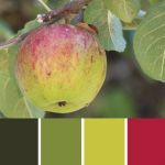
One of my favorite apples to eat is a crisp Braeburn Apple. So when Doug brought home this picture of a lovely speckled variety that was growing on a tree in our neighborhood, I was delighted to be able to use it for color inspiration!
Now I know this picture was not actually photographed during this holiday season that is just now getting underway… but I think the subject and colors are still perfect for this time of year.
Apples make a wonderful wintertime fruit, since they keep well in cooler temperatures. Apple pies, apple crisp and hot apple cider are a delicious and cozy treat to savior by the fire on a cold winter's day.
The colors themselves are perfect too. This set of colors are a fresher, more modern version of the traditional red and green of the holidays. I can picture them looking fantastic in holiday decor, as well as for jewelry and clothing accessories.
So even though this photo that Doug snapped was taken when the air was much warmer, it seems to be the perfect holiday palette for now, when the air is beyond crisp and is down right frigid out there!
Orchard is the dark green color found in the shadows of the fruit tree. Apple Tree is the mid-tone green of the leaves. Crisp Apple is the fresh, light green found at the base of the apple. And Braeburn Apple is the rich red color of the speckle top of this delicious and beautiful subject just waiting to be picked from the branch.
“
Recipes that someone has already taken the time to figure out are WONDERFUL! Thank you Cindy.
Kim C
“
Thank you 4000 times! I looked forever for blending techniques and when I finally found you I was ecstatic. I am independent earring designer and struggled with making good clay beads. You are my new hero!
Cyndee H
“
You know, if you ever decide to give up clay, you’d probably be very successful at Interior Design. Your color palettes are awesome.
Katie C
Shareable Images


Want to chat about today’s post? That’s what the comment section below is for. Scroll Down… We’d love to hear from you!
Or... if you would like to request a topic for a future post, here is the link to do that… PcT Suggestion Box
Hi Cindy, I don’t know if anyone has ever asked you this question before but I would like to know how you figure out the amounts of each clay to use when blending your colors. For instance, how do you decide to use 1/8 part of purple or 1/2 a part of ultramarine blue in something. This has puzzled me for a long time and thought I’d ask. Please don’t tell me it’s all trial and error as this would be a a lot of wasted clay on your part. Your recipes are so precise.
Thanks and Happy Holidays, Christine
Hi Christine, yes I have been asked that type question before. My method for coming up with the color recipes is a trial and error method but it is an educated one.
Just like if you are an experienced cook coming up with a new recipe, you know that you add only a pinch or so of some ingredients (like salt for example) and much more of another (like flour)… the same thing goes with color mixing. I can look at a color and know what its base colors are right off the bat… Say it is a particular dusty pink… I can see that it will be mostly made of White and Pomegranate, but I also suspect it may need a little of Ultramarine and a touch of Black to give it a more gray-purple tint to it. I know that the Pomegranate is strong, so I don’t start with much and add lots of White, then add tiny amounts of the other shades until I get what I want.
I have mixed hundreds of recipes over the years and have a good eye for what is needed and the approximate amounts it will take. Sometimes I nail it quickly and only have a small amount of clay that I used to get the final recipe. However, some of the more complex colors like the greens and the neutrals are more difficult, resulting in a big batch of clay before I get it right.
So you can see, it is trial and error… kind of. ;)
Oh yummy, one of my favorite apples is the Braeburn, and the Honey Crisp when I can find it. The colors are scrumptious and you have captured it perfectly. Believe it or not this color palette would make a beautiful flower or kaleidescope cane as I think the colors are so vibrant and compliment each other. Don’t you?
I Do think these colors would make great Kaleidoscope cane colors, Dixie Ann. Thanks for your comment!
Beautiful colors for the holidays! Love hot apple cider with spices in it.
Mmmm me too Cherie! Love to chew on the Cinnamon stick that has been sitting in the mug too!
Lovely colors, Cindy!
Thank you Maria! Hope you’re having fun getting ready for the Holidays.
Love this one Cindy !,
Happy to see that you love these colors Karon! Hope you are doing well.