
Dreaming Of Spring Color Palette-109 (Premo)
Includes 4 Premo Sculpey Color Recipes: — Dreaming — Longing — Anticipation — Wanting.
More...

** This post is an introduction to one of our paid color palettes.
I don’t know what’s up with me lately, but I really am longing for Spring. So much so that I mentioned I was restless waiting for it, in the last color recipe post of the Rain Dance Palette.
Any way, since it is always good to be ahead of the curve when it comes to fashion and jewelry making, I thought I would share with you another Spring color recipe palette for this Vol-057-B series.
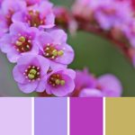
If you have been around this blog for a while, you may even recognize the flower used for this month's color inspiration. It is the very same flower that I used in the Bergenia Blossom Palette . But as you can see, if you go look at that previous palette and photo, the resulting color palettes are quite different.
You see, depending on the angle and the light in the photo, different colors will reveal themselves. And since you can never have too many beautiful flower photos or the stunning colors that can be drawn from them, I thought I’d introduce this flower to you again, in a fresh new light.
I hope you enjoy this inspiring Spring palette for the Vol-057-B recipe Series.
Dreaming is the palest pink purple found in the highlights of the bergenia blossom petals. Longing is the soft lavender found where the light shines through the back of the petals, revealing a more bluish hue. Anticipation is the rich fuchsia purple you see in the throats of the flower heads. And Wanting is the unusual tan green on the tips of the pollen coated stigmas.
“
I’m glad you can invision colors. Nature is a great source for inspiration… one could stay a wake all night just dreaming up colors. As a very new clayer I find your website very informative, you’re a very gifted person.
Jeanne C
“
Pulling colors from nature just fascinates me. Thank you for the recipes. By copying and working with them, we can start to develop or own “eye” for later experiments.
Sarah W
“
Cindy I have to share that you gave me the confidence to really commit to experimenting with mixing colors. I’m using your little pill sample technique and I’m so happy with the results! Plus my experimentation has led me to find a beautiful shade of purple that is just perfect for making beads to support my local university team. Fancy that! Plus it’s just a pretty purple! Thanks for instilling confidence and providing some really great recipes.
Kimberlee J
Shareable Images


Want to chat about today’s post? That’s what the comment section below is for. Scroll Down… We’d love to hear from you!
Or... if you would like to request a topic for a future post, here is the link to do that… PcT Suggestion Box
Hey I think that Dreaming of Spring orchid colour is the Pantone colour of the year. I was just thinking of how to go about mixing that and here it is in this weeks newsletter. Thx
I am certainly dreaming of Spring today in Toronto. Down to -20 again next week.
Thanks for all your hard work!
Barb
Love this palette.
Hi Cindy! Loving my new polymer clay techniques I have learned. I have been using the rock tumbler for sanding and buffing and it is making such a difference. Now I want to make a beautiful polish on the beads. I couldn’t find the floor varnish you used. They don’t sell it in the stores here and finding someone who knows what a water based acrylic is has been tough, lol. But I used min wax polyurethane water based floor varnish that works – problem is the brush marks and small bubbles. Any suggestions or a video that I might have missed that tells how to avoid this? Any special type of brush to get to put the finish on?
Thanks again for everything! I also made the rust like bracelet, and my first attempt was not done correctly. However, I made good use of it and made steampunk jewelry out of it. I’ll send pics of it. Thanks again!
Lisa-Marie
Hi Lisa-Marie, the best thing to avoid brush strokes when using varnish, is to use a high quality art brush. Sometimes they are even called varnish brushes. The bristles are so fine and the tips tapered so you will see very little, if any brush strokes on your pieces.
To avoid bubbles, stir your varnish, don’t shake. You can try blowing on the bubbles to pop them if you do get any.
I wouldn’t bother trying to find Future Floor Finish. There are much better finishes than that these days.
My new favorite finish is Renaissance Wax. Since it is a wax, you definitely will never get drips or brush strokes and it buffs to an incredible shine. It is a museum quality wax so you know it is safe to use on even your most special polymer clay pieces. Plus it has a UV protector in it that will help inhibit fading of additives like alcohol ink.
Hope that helps!
I am looking forward to seeing your pieces!
Oh Cindy, now your talking, such a lovely spring palette! We just
had a nasty winter storm with 6″ of snow and more to come on Friday. I am so ready for Spring! What caught my eye was the
pretty little flowers in the picture. Would it be possible to have a
Tutorial on them whatever they are? They just scream Spring!
That’s a great idea Dixie Ann! I will have to play with those and see if I can get them to look right. I could use some Spring Flowers myself!
Lovely colors! Can’t wait to use them.
Oh Joy_ Spring has Sprung! What a pretty palette. Can’t wait til Friday!!!!
I watched your video on sanding and it answered some questions I had about using this technique on my polymer clay pieces that I make. My question is will it change the image of the clay piece if you sand it? I have done a piece that I want to make a necklace out of and it was mistake piece but I can see faces in it and I don’t want to sand the image away. Can you help me with this???? Love your free videos.
Thanks Donna! Well, sanding can remove your image if you use too coarse a grit. Start with a higher grit like 400g, 600g or even 800g and just be careful not to remove too much material. It won’t be as flat and flawless, but you can still get a pretty nice finish that way. Good luck!
Thank you girls! I think these colors look even prettier in real life. Do enjoy!
Thanks Cindy for another beautiful color palette. I don’t know how you continue to come up with all the new colors but I’m glad you do. Have a great week everyone!
this really caught my eye. I guess I’m ready for Spring also. Beautiful palette.