
Vegas Wildflower Color Palette-031 (Premo)
Includes 4 Premo Sculpey Color Recipes: — Wildflower — Ginger — Desert — Safari.
More...

** This post is an introduction to one of our paid color palettes.
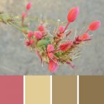
You may have already chuckled a bit about the name of this palette being called “Vegas Wildflower” since the two aren’t usually associated with each other. But to tell you the truth, I didn’t know what else to call it!
My husband Doug shot this photo of an unidentified wildflower while on a trip to Las Vegas some time ago. No matter how hard I tried to identify this beautifully colored beauty, I couldn’t figure it out. Anyone recognize it?
Any who… just because a flower goes unnamed, doesn’t mean it isn’t just as pretty. So I went ahead and made a color palette anyway!
Wildflower is the unique mulberry type pink of this mystery wildflower. Ginger is the pale tan color of the stems left behind from the spent flower pods. Desert is the gray green khaki that makes a perfect neutral for the palette. And Safari is the darker companion to Desert that acts as a grounding base color for the rest of the color recipes.
“
I love these colour recipes Cindy. And I love being able to think of an idea involving different colours and knowing I’ll most likely find exactly how to make it in the library. Thanks.
Aims
“
YES!!!I love your recipes! More, more, more!
Jamie H
“
Hi Cindy, first, I want to say thank you for the great color palettes and amazing projects. I love making canes inspired by your rich color groups, and cannot wait until Fridays to see what wonderful projects you have up your sleeves. :)
Lindsay M
Shareable Images


Want to chat about today’s post? That’s what the comment section below is for. Scroll Down… We’d love to hear from you!
Or... if you would like to request a topic for a future post, here is the link to do that… PcT Suggestion Box
Doesn’t Las Vegas mean ‘the wildflowers’? Plus, as someone said, desert plants burst in the spring with the rains because they know there won’t be anymore later that year.
This palette is just gorgeous!
Funny, I was just thinking about your colour palettes today (as I downloaded them into my new computer) and was struck by the names you give your colours. The names are all so lush and original, it’s impossible NOT to try to mix them to see what they look like.
That’s not a daft question Angela. It is actually a great one! As artists and designers we rarely use a color straight from the package. Especially when working with artist pigment based colors such as the ones Premo makes, which are considered the primaries from which all other colors come from.
The problem is that it takes practice to get good at color mixing and creating colors that go well together (palettes). So I decided I would put together recipes of coordinated colors to make it easier for people new to polymer clay, to make designer looking beads and projects.
You can use these color palettes in many different ways. First, you can just choose 1 color from the group and use that color to make your beads with. Or you can choose 2 or more of the colors to make beads that are guaranteed to work well with each other.
Another way is to use the colors in a cane project or technique such as Mokume Gane or Graffiti Beads where more than one color is layered next to another.
The recipes are also excellent tools for learning how to create your own distinct color recipes. As you mix my recipes, you will get to know the properties and strengths of the different pigments and how they will end up looking when mixed. This will train your brain about color and eventually you will be able to create recipes on your own.
Lastly, sometimes I will create a project that uses a specific color palette which you can mix to create the identical project. I did this in the case of the Holly Leaf and Berry Cane Tutorial where I used the Alpine Succulent Red Color Palette.
Hope that answers your question. Make sure to spend time reading the older posts in the blog so that you can familiarize yourself with all the valuable information available. ~Have fun!
PS: Glad to hear everyone else’s comments as well, about this Vol-031 Vegas color palette… even though we don’t know which flower it is :-) Thank you so much for posting your thoughts and feedback.
Let me say firstly I am new to Polymer clay. I love my weekly tutorials and look forward to receiving back issues. This sounds daft but could you tell me what the Colour Recipes each week are for?
Love the palette for this month! Can’t wait!!
Checked western wildflowers in three handbooks, can’t find a match for that picture, lol.
Maybe it’s a genetic mutation?
Cindy/Doug: What a lovely palette! I wish I knew the proper name for the delightful “Vegas Wildflower”, but I doubt I could help even it were growing in my backyard (I’m terrible with flower names!) Doug, you seem to have captured it’s beauty perfectly, and the palette Cindy created is a gorgeous match. Thanks so much, Team Lietz! You amaze with your brilliance week after week… Looking forward to getting these recipes!
——————-
Yay! So happy that all the emails, FB comments, and Cindy’s petition! got Polyform to listen to us…fantastic news! Thanks for letting us know about this important issue, Cindy. Your announcement & petition got the ball rolling…encouraged us to comment at the FB page, and send emails, too. You helped save the primaries — whether Polyform read the petition or not! You’re my hero! ;D
Also, I agree with you guys — let’s keep going! Let’s see if we can also get them to keep Sea Green, and the Pearl colors, too… :D
LOVE this color palette…such a pretty blend of pink and accent colors!!
‘Cause what I shoulda said, lest my eyes are deceiving me is that the PETITION WORKED!!!!!
Now will someone head over to Polyform Products Facebook page and make sure I’m not dreamin’?
@Elizabeth S.: Yay!, Elizabeth it looks like they’ve responded and will keep the primaries – c.blue and z.yellow. Frost is simply a name change – Polyform explains it is the same color. I’m confused about the Pearl decision and new glitter clays though?? Glitter can be added easily enough, and in the colors we choose. Fluorescents (and possibly Glow in the Dark) are still affected too, and not likely easily replaced with a color recipe :(
Thanks so much Cindy and everyone for contributing…the social media thing can be such an amazing tool!! This was accomplished in the course of a weekend. Wow! =)
@Elizabeth S.: YEP _you are right. Got an e-mail from Polyform today. They are keeping Zinc Yellow and Cobalt Blue. We won round one. Now on to round two -all the other colors we deem necessary. Send Polyform an e-mail direct. I send one yesterday and they responded todayl YEAH!!!!!!!!!
Cindy, I din’t forget you ! Just excited about the Premo. The colors for the Vegas flower is lovely. Just colors to calm the soul.
You know, sometimes the desert surprises us with beautiful flowers that noone notices enough to identify. Leave it to Doug to capture it so beautifully. Beautiful palette.
Psst, are we gonna need cobalr blue, zinc yellow or sea green???
Love those colors Cindy!!
The photo is stricking, great job Doug! Of course we have come to expect nothing less than equally stricking palettes from you, Cindy. You certainly proved it here. Love it!
It looks kind of like a Fireworks flower… But looking at it closer, I’m just not sure… Pretty flower, pretty palette..!!
Clay On,
~Lisa :)
Lovely palette, Cindy! :)
Great colors. Maybe someone from this blog will solve the mystery flower name.