Red Polymer Clay Color Mixing Tips – A Riveting Story About Saturation
Video #17: See how two Red’s that look similar to the eye, can behave quite differently when you mix them with other colors.
More...

IN THIS POST: — mixing colors — saturation — red — cherry red — fimo –color theory — color mixing — (Topics marked with an asterisk* are discussed in the Comments Section below).
Wow! You must really be a fanatic to click on a headline that promises to share riveting stories about mixing red polymer clay :-). Don’t worry though. I’m crazy about clay too so we’re in the same boat.
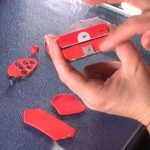
Today’s tip is about how some shades of a particular color are more dominant than others. This is especially true with red polymer clay. For example, I once mixed 2 shades of red Fimo together to come up with a new, warmer tone about half way between the original two. I was surprised to discover that the required mix ratio ended up being 6 to 1 instead of 50:50 as I had initially thought it would be.
When you are experimenting with your own custom color combinations, it’s best to add small amounts of the stronger color of polymer clay to the weaker one, until you get the desired result. If you mix from the other way around, you’ll probably end up making more of the new color than you need.
In This “Color Saturation” Video… I show how two quite similar looking red colors can have very different properties.
Transcript not available for this video.
Our goal is to translate these videos into as many languages as possible. If you are interested in helping with this initiative, then please do contact us and we will figure out a way to make it worth your while :)
Resource Links:
- Related Video: Polymer Clay Color Mixing Color Saturation
- Related Video: Understanding Polymer Clay Color by Making Mud
- Related Video: Learning About Polymer Clay Color Mixing Maggie Maggio Style
- Related Video: How To Mix Polymer Clay Tutor Color Recipes
- Related Video: Color Plus 1 Polymer Clay Color Mixing Trick
- Amazon: Geometric Shapes Cutters in Graduated Sizes **
Resources marked with a double ** asterisk are affiliate links. If you click on them and decide to buy something, we may receive some compensation. This does not affect the price you pay in any way. What it does do, however, is helps us to continue providing free videos for you, here at the PcT website. Using our links to purchase your tools and supplies, is always greatly appreciated.
Sponsored Ads & Special Promotions
Shareable Images
To share this full blog post anywhere on the web that allows links in comments, here's a shortened url to copy and paste...
>> https://mypct.ca/v17 <<
Want to chat about today’s post? That’s what the comment section below is for. Scroll Down… We’d love to hear from you!
Or... if you would like to request a topic for a future post, here is the link to do that… PcT Suggestion Box
No Katina. With clay some colors that look about the same can have completely different saturations of pigments.Because of these differences it can be tricky when first learning about polymer clay color mixing. I show how to test this in a video in my Bead Making Beginner’s Course.
White polymer clay does have a high opacity to it and will ‘weaken’ the color dramatically.
Would you consider ALL the deep reds, oranges and pinks to be “powerful”? I know when I’m painting it’s harder to cover some deeper shades that have red in them.
If I decide to add a really light color, like white or ivory, does it decrease the powerfulness of the original color?
Has anyone out there tried this?
Unfortunately the video camera does not pick up the color differences as well as your own eyes will. But practice the techniques and tips I discussed with some of your colors, and you’ll see what I mean.
Watch out for those powerful reds, especially Alizarin Crimson. Always add just a small amount to start so you don’t end up with way more than you need. Black is also a powerful color. Yellow, however, is much more forgiving and you’ll always need more of it than the other colors you are mixing it with.
Cindy’s last blog post..Striped Cane – An Easy Polymer Clay Cane Project For Beginners