Managing Color Contrast With Skinner/Teardrop Blends
Video #722: Some easy color management tips that will help you to create better polymer cane designs, with more definition.
More...

IN THIS POST: — skinner blends — teardrop blends — color blends — gradients — ombre — contrast colors — better cane designs — cane designs — (Topics marked with an asterick* are discussed in the Comments Section below).
In today’s video I will show you how to add more contrast to your polymer clay Skinner blends or Teardrop Blends.
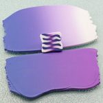
If you are not familiar with Skinner Blends, it’s when you take more than one color of polymer clay and use a blending technique to create a gradient sheet of clay that blends from one color into the next, in an Ombre effect.
There are lots of cool things you can do with a Skinner / Teardrop Blend.
In fact, in this video I had planned to show you a polymer clay cane using a Skinner Blend, called a Zipper Cane. But when I went to make some samples, it occurred to me that you may not know how to make sure that the colors you chose for this cane had enough contrast in them, to make a cane the works. So I decided to show you the blends this time, and I will show you how to make the cane in the next video.
I show some examples of Zipper canes. When you look at all the samples, the canes that have the most contrast in their colors, are the ones that show the zipper pattern best.
The colors that are too close in value (i.e. the colors that are not that darker or lighter than than the other), will not have enough contrast to show off the zipper effect. Patterns get “visually” lost, because they blend with your eyes. This is especially accentuated when the cane is reduced.
The easiest way to get great contrast, is to blend a dark color with White… like I did with the Ultramarine Blue and White. Most instructors do this with their Skinner Blend instructions… which is good.
But… there are other options you may want to pursue as well. For example, what if you wanted to combine a couple of colors that did not have a lot of contrast between them? What you can do is amp up your blends by either adding a darker shade at one end, or a lighter shade at the other… or maybe even do both!
In the video I do a Teardrop Blend using Periwinkle (Premo) and Wisteria (Premo), which are both of the same color value. So the blend ends up with not enough contrast. To fix this, I add White to the Wisteria side of the blend. This is way too hard to explain in writing… but it will make sense when you watch the video... :)
00:00:03 –> 00:00:08 Hi guys, it’s Cindy Lietz, your Polymer Clay Tutor and today’s Studio Tip, I’m going to show
00:00:08 –> 00:00:13 you how you can get more contrast in your polymer clay Skinner Blends.
00:00:13 –> 00:00:19 Now, if you’re not familiar with what a Skinner Blend is, that is a color blend where you
00:00:19 –> 00:00:27 can take more than one color of polymer clay and then you blend it into a gradient sheet
00:00:27 –> 00:00:33 or an ombre kind of technique like this where you have one color shift to another color.
00:00:33 –> 00:00:40 Now, you can do this with more than one color, I mean more than two colors too, if you want
00:00:40 –> 00:00:44 but there’s a lot of cool things that can be done with a Skinner Blend.
00:00:44 –> 00:00:50 In fact, I was going to this week teach you how to make one of these Zipper Canes that
00:00:50 –> 00:00:58 uses Skinner Blends but during the process of making the samples, I realized that a lot
00:00:58 –> 00:01:05 of you may not understand how to get enough contrast in your Color Blends so that you
00:01:05 –> 00:01:07 can get the proper effect.
00:01:07 –> 00:01:15 Now, I’m –now I’m just going to show you the samples that I have here, I have these
00:01:15 –> 00:01:21 Zipper Canes that are done in several different colorways but if you carefully look at the
00:01:21 –> 00:01:28 different patterns here that we’ve got, you’ll be able to see that the– the canes that have
00:01:28 –> 00:01:30 the most contrast in color.
00:01:30 –> 00:01:39 So they go from the darkest to the lightest will have the the best effect in showing this
00:01:39 –> 00:01:44 Zipper Cane effect so the way the Zipper Cane is made is you make a blend then you chop
00:01:44 –> 00:01:47 it up and you flip it back and forth and do these different things with it which I’ll
00:01:47 –> 00:01:53 show you next week but if you have a blend that has a lot of contrast.
00:01:53 –> 00:02:00 So, from from the dark to the white here, you will get a cool effect but if you have
00:02:00 –> 00:02:05 the colors are too similar to each other, like in this case we’ve gotta blend from a
00:02:05 –> 00:02:09 Cadmium Red to kind of a Pearly Pink color.
00:02:09 –> 00:02:14 Here, the colors are too close and value so they’re both medium colors there neither or
00:02:14 –> 00:02:23 light and so beside each other even though the effect is kind of cool, it loses the drama
00:02:23 –> 00:02:28 to it because it’s– the colors are too similar and especially from far away, or if you do
00:02:28 –> 00:02:32 reduce this cane you would start losing the pattern visually.
00:02:32 –> 00:02:36 I mean the pattern’s there but you just can’t see it as well because the colors are blending
00:02:36 –> 00:02:38 with your eyes.
00:02:38 –> 00:02:49 So, the easiest way to get a really obvious contrast between two colors is to use a dark
00:02:49 –> 00:02:57 color like I’ve got here this is a Ultramarine Blue and then White, so White is White and
00:02:57 –> 00:03:02 these are both Premo colors but you know, there’s a lot more blends than just from color
00:03:02 –> 00:03:06 to white and I mean this is what most people will show you when they’re talking about a
00:03:06 –> 00:03:13 Skinner Blend is they’ll show you, you know, from a color to White and so what will happen
00:03:13 –> 00:03:18 is you’ll go and you think well I don’t want to just do White– White and colored one I
00:03:18 –> 00:03:23 want to do two colors that I really love so you pick something like these two colors here.
00:03:23 –> 00:03:27 Now, these are the two new colors from Premo.
00:03:27 –> 00:03:34 They are what is this one this one is Periwinkle and this is Wisteria and they’re both very
00:03:34 –> 00:03:40 pretty colors but if you blend them together into a Skinner Blend or a Teardrop Blend,
00:03:40 –> 00:03:44 which is my method of doing it which is much easier and I’ll show you that in up I’ll show
00:03:44 –> 00:03:47 you how it goes in a second.
00:03:47 –> 00:03:53 If you blend those two colors together and into a gradient like this, because these are
00:03:53 –> 00:04:02 equal value, they’re both medium colors, the blend is very pretty but it’s not going to
00:04:02 –> 00:04:07 work very well for a zipper cane because the contrast isn’t that high and you can really–
00:04:07 –> 00:04:11 you can test out your blends to see if there’s much contrast if you’re not seeing it here
00:04:11 –> 00:04:17 by just putting the two ends together and then if you kind of squint your eyes if the
00:04:17 –> 00:04:21 color sort of melt together then and there’s no contrast there.
00:04:21 –> 00:04:27 If I put the this blend here, for example, next to each other, and I squint my eyes,
00:04:27 –> 00:04:35 I can still see that there’s a big difference between light and dark but say you’ve done
00:04:35 –> 00:04:39 this blend you think it’s really pretty, you still want to use it you don’t have to throw it away
00:04:39 –> 00:04:43 What you can do is you can amp it up.
00:04:43 –> 00:04:46 Now, it’s very simple to do.
00:04:46 –> 00:04:50 So, this –the way the Teardrop Blend works and like I said, you’re going to have to go
00:04:50 –> 00:04:55 watch the video the Teardrop Blend Video but to take your color of clay, you shape it into
00:04:55 –> 00:05:03 a teardrop, so I’ve got the the Periwinkle and the Wisteria shaped into teardrops you
00:05:03 –> 00:05:09 set them opposite each other and they become the shape of a triangle and then you run them
00:05:09 –> 00:05:12 through the Pasta Machine like this.
00:05:12 –> 00:05:17 Now, if you don’t have a Pasta Machine, you can use an Acrylic Roller, I also have a video
00:05:17 –> 00:05:22 for that it takes a lot longer to do but it is possible.
00:05:22 –> 00:05:29 So you fold it in half and you keep running it through the machine until you get a blend
00:05:29 –> 00:05:34 oh and this one you can just tuck back in there, there’s no big worries about that and
00:05:34 –> 00:05:41 you just keep blending over and over and over and it takes quite a few passes and the colors
00:05:41 –> 00:05:45 will, and you can see here it’s just starting to blend in the middle but the colors will
00:05:45 –> 00:05:49 eventually blend into a smooth blend.
00:05:49 –> 00:05:55 Now, so I’ve done that here already just to save us some time but like I said we can amp it up.
00:05:55 –> 00:06:01 We can either darken the dark or we can lighten the light so I’m going to look at my blend
00:06:01 –> 00:06:05 here and choose which one is the lightest this purple-y color is the lightest one of
00:06:05 –> 00:06:12 the two and I’m just going to take some white and it could be Pearl it could be some other
00:06:12 –> 00:06:21 super light color but White is going to work quite well and I’m just going to stick it on top
00:06:21 –> 00:06:26 I could– if I wanted to go the other way and darken up this other end I could stick
00:06:26 –> 00:06:27 a dark color onto here.
00:06:27 –> 00:06:33 it would have to be one that would blend nicely with that Blue then what I’m going to do is
00:06:33 –> 00:06:41 just run this through the Pasta Machine and fold it in half and keep running it through
00:06:41 –> 00:06:44 until those colors blend together.
00:06:44 –> 00:06:48 Now, see this guy is all acting out of control.
00:06:48 –> 00:06:55 That’s no big deal, I think people get too worried about this kind of thing you can always
00:06:55 –> 00:07:02 just tuck that back in and it will start working its way into your blend really quite easily.
00:07:02 –> 00:07:09 You can be a little bit more– less worried and more– just force that clay to do it what
00:07:09 –> 00:07:12 you want it to do it.
00:07:12 –> 00:07:17 There’s another clay out there that says you’re the boss of the clay or something like that.
00:07:17 –> 00:07:18 It’s great, cute.
00:07:18 –> 00:07:25 OK, so as you can see as I keep blending this is going to end up lightening up and bringing
00:07:25 –> 00:07:28 the contrast up of those colors.
00:07:28 –> 00:07:33 Now, we don’t have a lot of time because it takes several passes to go through but if
00:07:33 –> 00:07:39 I was to continue to blend, I would get more even blend like this and you would have much
00:07:39 –> 00:07:42 more contrast here to the end color.
00:07:42 –> 00:07:44 See that now?
00:07:44 –> 00:07:51 So that if I want to use this in a cane like this with a Zipper Cane, I’m going to get
00:07:51 –> 00:07:54 a much more effective design.
00:07:54 –> 00:08:00 Now, there are lots of different things you can do if– if for example, you didn’t have
00:08:00 –> 00:08:05 quite enough white you could always throw on just another little strip of white on the end.
00:08:05 –> 00:08:08 Now, I did something very similar to this one here.
00:08:08 –> 00:08:16 I had a blend of Gold to Silver the there wasn’t enough contrast in the color so I threw
00:08:16 –> 00:08:22 a little White on the end and I threw a little bronze on this end and I ended up with a cane
00:08:22 –> 00:08:25 that had some nice contrast.
00:08:25 –> 00:08:31 Now, this is a really fun and easy cane, I will show you how to do that next week.
00:08:31 –> 00:08:37 And go ahead and start trying to do blends, do little tiny batches if you want and you’re
00:08:37 –> 00:08:42 going to end up start– you’ll start understanding how the blends work.
00:08:42 –> 00:08:47 You can always throw in a little more color to boost it up and get a little more contrast
00:08:47 –> 00:08:54 and I hope that was helpful for you, that you learned something from this and if you
00:08:54 –> 00:09:01 did like this video do let us know and if you’ve got suggestions for future videos,
00:09:01 –> 00:09:05 techniques that you’d like to learn, products you liked us to test and you haven’t seen
00:09:05 –> 00:09:10 a video done on it yet, then do leave a suggestion in the comments section below.
00:09:10 –> 00:09:14 We do have a ton of video so make sure to search through those and see if you can find
00:09:14 –> 00:09:15 what you need there.
00:09:15 –> 00:09:18 Alrighty, so we’ll see you next week and bye for now.
Our goal is to translate these videos into as many languages as possible. If you are interested in helping with this initiative, then please do contact us and we will figure out a way to make it worth your while :)
Resource Links:
- Related Video: Teardrop Blend Color Gradients Made Easy
- Related Video: Easy Skinner Blends No Pasta Machine
- Related Video: How To Make Long Skinner/Teardrop Blend Strips
- Related Video: Is Your Skinner Blend Getting Too Wide
- Related Video: Teardrop Blend Shift – Color Way Variations
Resources marked with a double ** asterisk are affiliate links. If you click on them and decide to buy something, we may receive some compensation. This does not affect the price you pay in any way. What it does do, however, is helps us to continue providing free videos for you, here at the PcT website. Using our links to purchase your tools and supplies, is always greatly appreciated.
Sponsored Ads & Special Promotions
Shareable Images


To share this full blog post anywhere on the web that allows links in comments, here's a shortened url to copy and paste...
>> https://mypct.ca/v722 <<
Want to chat about today’s post? That’s what the comment section below is for. Scroll Down… We’d love to hear from you!
Or... if you would like to request a topic for a future post, here is the link to do that… PcT Suggestion Box
Hi Cindy,
Loved your descriptions of the teardrop blend. Amp it up, Stick it on top (chuckle), out of control, force it to do your bidding etc. I had to watch and listen again to hear your chuckles. How different to how I learned, cutting with much precision, measuring, angles, etc. All quite daunting for a newbie,( many years ago). Love your practicality, hands-on, take control attitude, just love it. Also makes me LOL.
The industrial multi layered storage looks interesting. I had a similar “giant one” when I ran my shop. About 6ft bottom diameter, with increasing smaller shelves. It was so practical but sold it for a song as was too big to store! Wish we had Harbor Freight here in UK. Will have to look at some shop-fitting sites, they might just do something similar. Off to get some shopping for my trip now the storm has past.
Question, do you use a spring loaded centre punch? I have just ordered one as it looks a very useful tool as working with sheet copper at the moment till I get my stash of PC out of storage….cheers xx..
LOL Thanks Elaine! Glad you liked the relaxed style of my teaching. This is a hobby after all, it is supposed to be fun! You can get seriously good at something without having to be super serious about the way it is taught. It is a hunk of plastic we are working with here… not diamonds. I challenge every one of the ‘Masters” to a Blend Off! There is no need for mathematical formulas and geometric angles to get exactly the blend you want.
In regards to the industrial revolving storage bins, I believe my Grandpa had one of those giant floor models in his gastation – auto repair shop when I was a kid. Not sure if one that size would fit in my studio neither but this one isperfect! It is only 1 foot in diameter and has 4 tiers. Holds a ton of stuff and takes up little space. It is perfect for those unused corners of your space.
To answer your question, I don’t have a spring loaded center punch in my Studio yet. Doug has one in the shop and I have been tempted to steal it. The are great if you are drilling a lot of holes. They keep you bit from skittering all over the surface before it gets a chance to bite into the material you’re drilling. I don’t think they are very expensive either. I think they would be a worthwhile tool to have.
“I have come to believe that a great teacher is a great artist. Teaching might even be the greatest of the arts since the medium is the human mind and spirit.” – John Steinbeck
What a beautiful quote Fran! Thank you!
Great tip Cindy on manipulating colors when making a blend. This will definitely go on “My Hot Tip List”. Really looking forward to next week when you show us how to make a zipper cane. Have always wanted to make one. I noticed a black round container behind you with several sections that looks like metal and moves like a turntable? Can I ask where you got it?
Yeah that is a revolving storage bin I got at Harbor Freight online. It was really reasonable in price and holds an amazing amount of stuff. Will do a video on it sometime, but thought I’d give everyone a break from the product videos for a few weeks. It took awhile to put it together… it had a million nuts and bolts, but I love it! Looks all industrial too! :)